

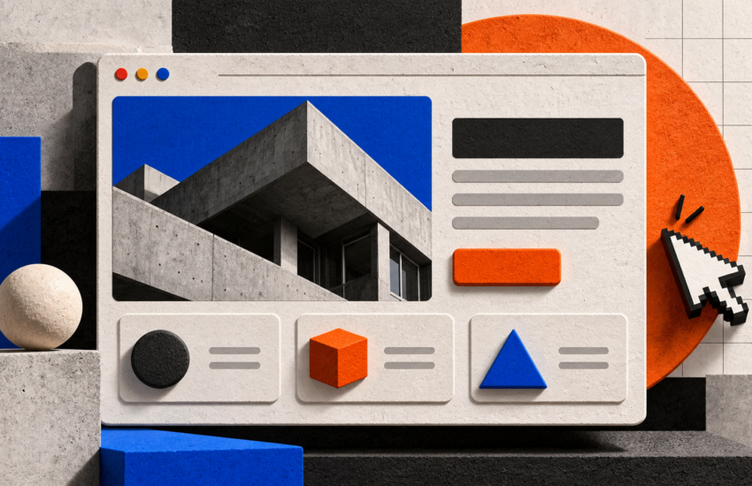
Tactile Brutalism in Web Design Raw Geometry Meets Precision UI
Tactile brutalism in web design combines raw geometry, bold typography, visible borders, and textured surfaces with carefully engineered user interfaces. The goal is to create a distinctive digital experience that feels tangible and expressive without sacrificing usability, accessibility, or performance.
As brands compete for attention online, this approach offers an alternative to polished, template-driven websites. However, its success depends on how well designers balance visual experimentation with practical interface design.
What Is Tactile Brutalism in Web Design?
Tactile brutalism is a design approach that makes a website feel structured, physical, and deliberately constructed. It often uses hard edges, exposed grids, high-contrast colors, layered surfaces, and typography that becomes part of the visual identity.
Unlike minimal designs that hide interface structure, tactile brutalism makes that structure visible. Borders define sections, shadows suggest depth, and textures introduce a sense of material.
The style overlaps with neo-brutalism, but its emphasis is on the tactile quality of the interface and the precision behind its construction.
What Are the Core Principles of Tactile Brutalism?
1. How Do Raw Geometry and Visible Grids Shape Layouts?
Raw geometry web design uses rectangles, straight lines, asymmetrical compositions, and clearly defined sections. Instead of adding decorative elements without purpose, designers use structure to guide attention.
CSS Grid and Flexbox help developers create these layouts while maintaining consistent spacing and responsive behavior.
2. Why Do Textures and Hard Borders Matter?
Textures can make digital surfaces feel less flat. Subtle grain, paper-like backgrounds, solid borders, and offset shadows can create depth without requiring complex 3D effects.
The key is restraint. Too many textures or competing visual elements can make a website difficult to read.
3. How Does Typography Establish Visual Hierarchy?
Bold display fonts, oversized headings, and contrasting text sizes are common features of tactile brutalism. They help communicate personality and direct attention toward important content.
Pair expressive headings with readable body text. Navigation, descriptions, and calls to action should remain easy to understand.
How Can Designers Implement Tactile Brutalism?
Engineered precision UI means translating a visual concept into a consistent, functional design system. Every border, spacing rule, interaction, and responsive adjustment should serve a clear purpose.
These styles create a simple foundation for a tactile interface. Developers can extend the system with hover states, layered shadows, subtle textures, and responsive layouts.
For complex websites, the same principles should be applied consistently across navigation, forms, cards, and other interface components.
Businesses planning a custom interface can explore DigiBusiness360’s website development services to understand how design, responsiveness, and development work together.
When Does Tactile Brutalism Work Best?
Tactile brutalism can suit creative agencies, design portfolios, independent publications, cultural organizations, fashion brands, and businesses that want a distinctive visual identity.
It can also work for product landing pages when strong visual presentation supports the brand message.
However, it is not the right choice for every project. Websites serving audiences that prioritize simplicity, familiarity, or rapid information retrieval may benefit from a more restrained interface.
The decision should depend on the audience, brand identity, content, and user journey, not simply on whether the style looks current.
How Can You Balance Accessibility and Performance?
Modern UI design trends should never take priority over the basic requirements of a usable website.
Follow these principles when implementing tactile brutalism:
- Maintain readable contrast: Ensure text and interface elements remain distinguishable from their backgrounds.
- Support keyboard navigation: Provide visible focus indicators and ensure interactive elements work without a mouse.
- Design for mobile screens: Test navigation, typography, buttons, and grids across different viewport sizes.
- Control animation: Avoid unnecessary movement and respect users’ reduced-motion preferences.
- Optimize textures: Use appropriately sized assets and avoid expensive visual effects that slow rendering.
- Test real performance: Google’s Core Web Vitals define good-experience thresholds of LCP at 2.5 seconds or less, INP at 200 milliseconds or less, and CLS at 0.1 or less, measured at the 75th percentile.
These benchmarks help evaluate the actual user experience; they do not prove that any particular visual style performs better.
For further technical guidance, consult Google’s Web Vitals documentation. You can also explore DigiBusiness360’s SEO services for information about website visibility and technical SEO.
How Can You Evaluate a Tactile Brutalist Website?
Before launching, ask these questions:
- Does the design reflect the brand’s identity?
- Can visitors understand the page hierarchy quickly?
- Are buttons, links, and navigation easy to recognize?
- Does the layout work on mobile and desktop?
- Can users navigate the interface with a keyboard?
- Have page speed and layout stability been tested?
- Do analytics show that visitors can complete important tasks?
Use usability testing and real performance measurements to identify problems. A visually striking website is only successful when people can use it effectively.
-
What is the difference between brutalism and neo-brutalism in web design?
Brutalist web design emphasizes directness, raw structure, and minimal ornamentation. Neo-brutalism often uses bold colors, thick borders, and exaggerated shadows in a more playful visual style. The boundaries between these approaches are not universally defined.
-
Is tactile brutalism suitable for business websites?
Yes. It can help design-led businesses communicate a distinctive identity, provided that navigation, readability, accessibility, and conversion paths remain clear.
-
Can tactile brutalism be created with CSS?
Yes. CSS Grid, Flexbox, borders, shadows, pseudo-elements, and carefully optimized textures can create many tactile effects without requiring complex graphics or heavy animation.
-
Does tactile brutalism improve conversions?
Not automatically. Conversion performance depends on audience expectations, content clarity, usability, trust, and the overall customer journey. Test meaningful design changes instead of assuming that a trend will produce better results.
-
Is tactile brutalism mobile-friendly?
It can be. Developers should adapt layouts, font sizes, spacing, and interactions for smaller screens rather than simply shrinking a desktop design.
Building Websites With Character and Precision
Tactile brutalism in web design brings raw geometry, expressive typography, textured surfaces, and engineered precision together in a distinctive visual approach. Its real value lies in creating an interface that reflects the brand while remaining accessible, responsive, and functional.
The best implementation is not the most visually aggressive one. It is the one that uses design decisions intentionally and supports the needs of its audience.
